
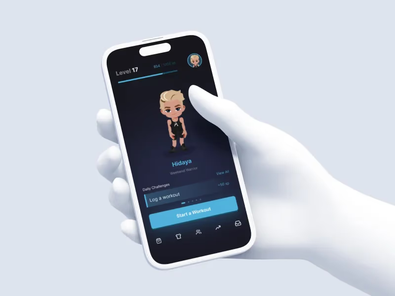
Owning the whole loop
I work closely with our CEO, Parsa, deciding what Avatone needs next. Once a feature is mine, I research it, design it, build it, and refine it. I have final say on UI and UX, while Ramy owns merge approval and technical quality. Victor shapes the artwork, and Danny handles the audio.
Avatone is a fitness app built around avatars and rewards. More than 70,000 lovely people have joined so far.

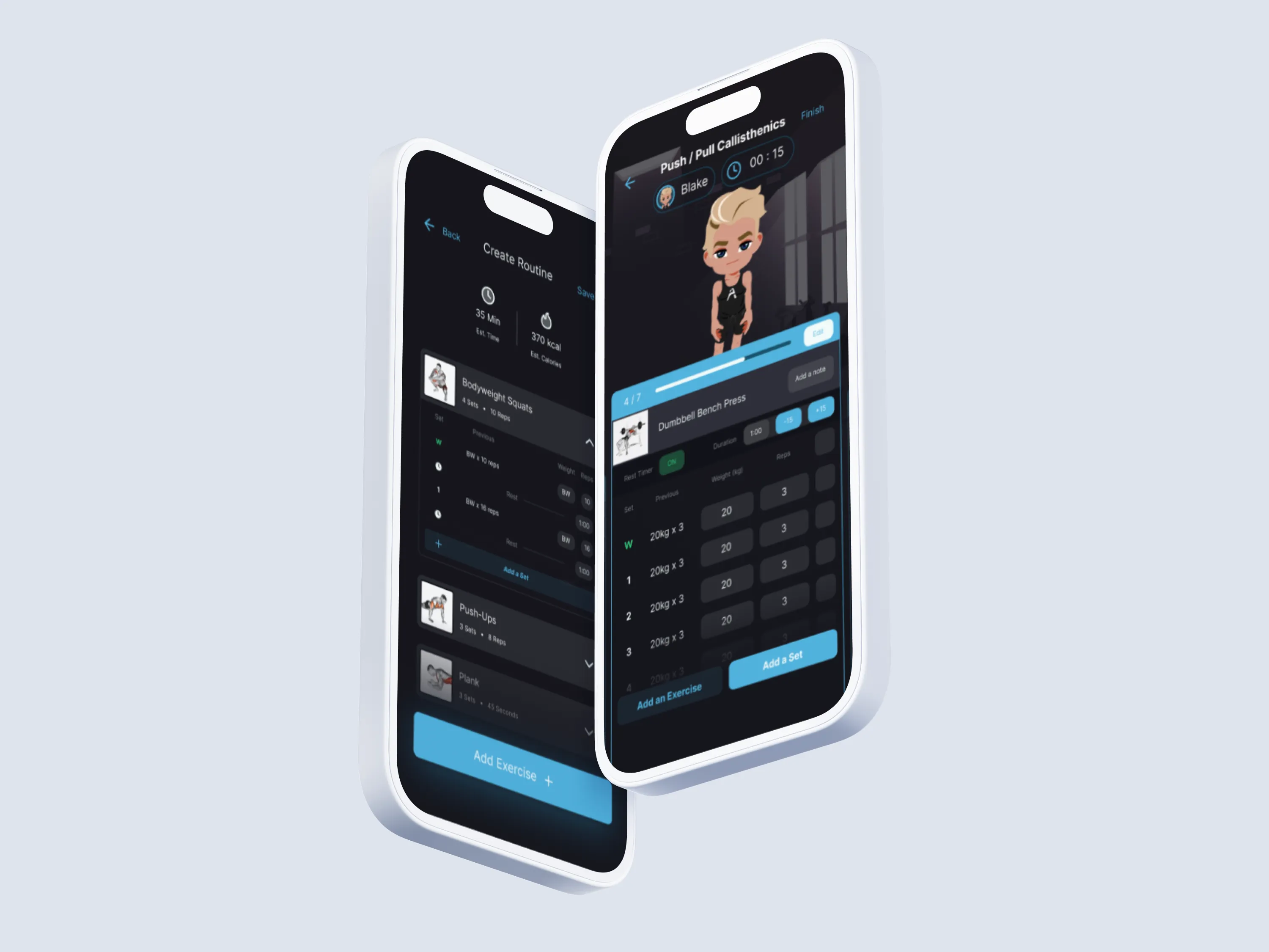
That button everyone kept pressing
The first iteration of our onboarding demanded an answer to every question. Firmly. Designed as though the users actually wanted to answer every question, rather than diving straight into the app. This was a pain point, as evidenced by users in our session replays hammering the disabled “continue” button on every screen.
We rebuilt the panels around the avatar, let people skip non-essential fields with sensible defaults, and finished with a 1,000 Grit reward (in-app currency) to spend on basic cosmetics. It became playful, quicker, and easier to understand.

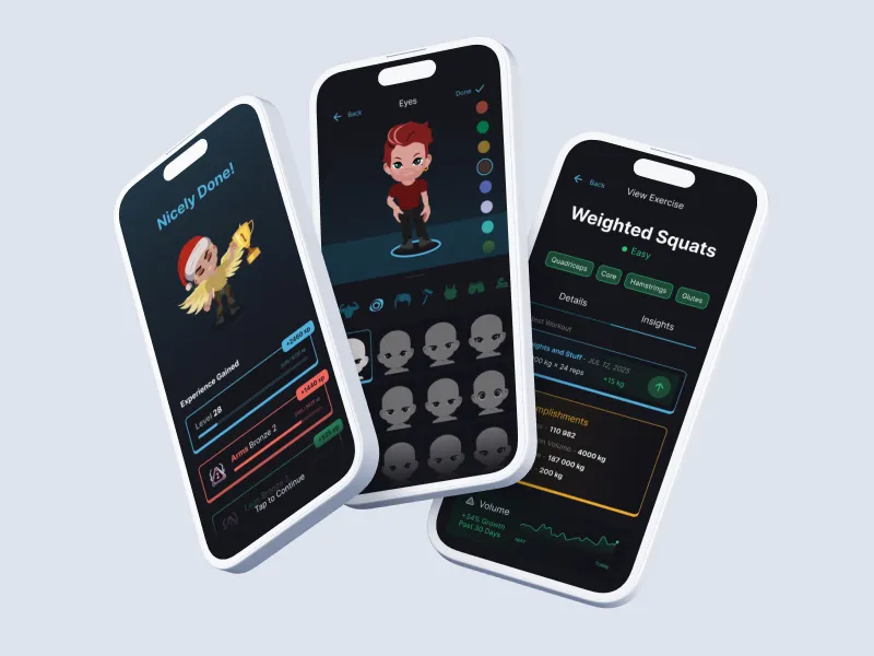

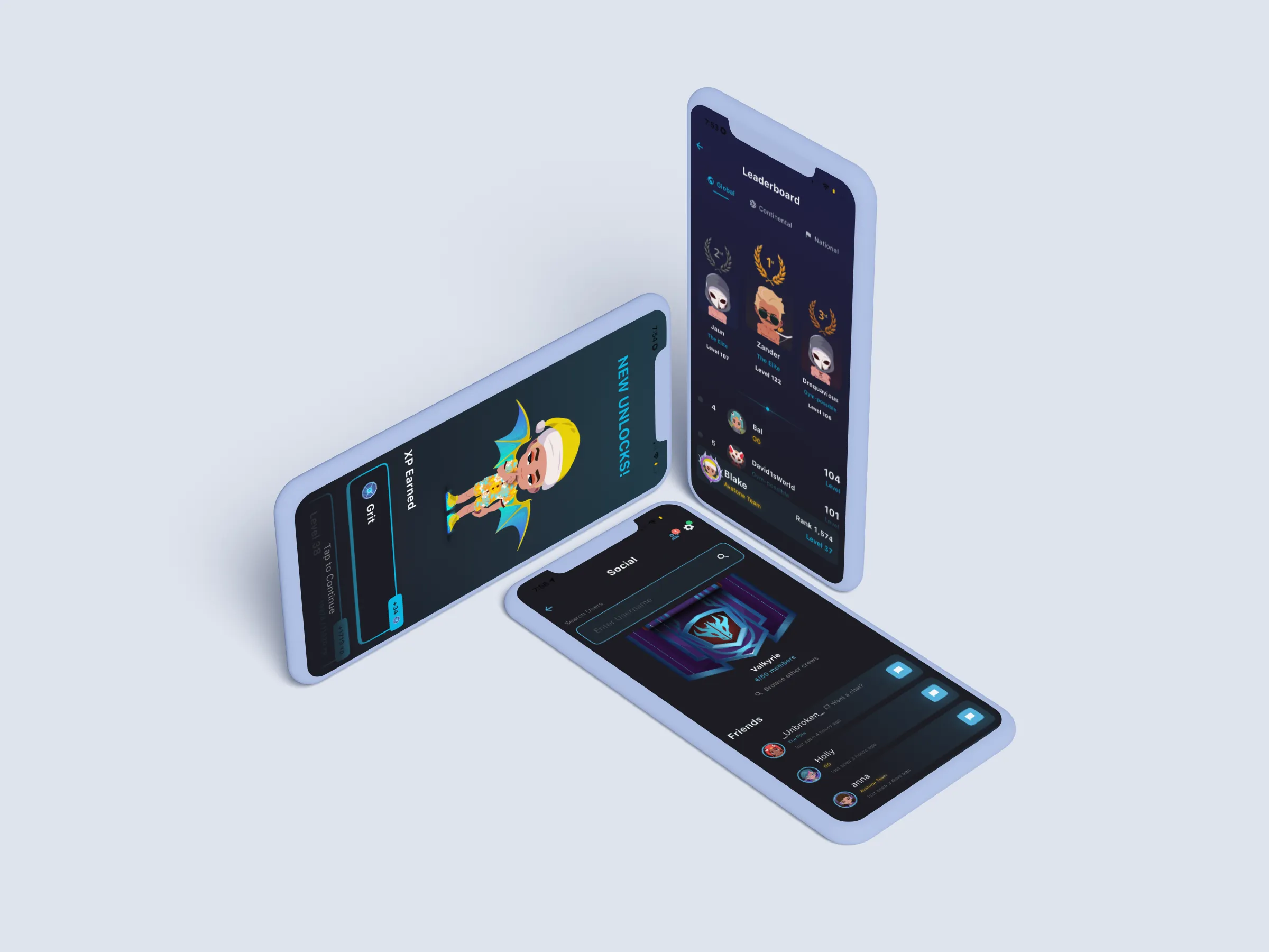
Still shaping it
I use the same loop across the product and everything else that I touch: watch what people do, find the friction, make the change, then measure. Avatone keeps making that problem more interesting.